When I scan the market for potential trades, the first thing I check is where price sits in relation to support, resistance, or the nearest trendline. It gives me a quick sense of the environment whether the move has room to breathe or if it’s already pushing into trouble.
Support and resistance are still the most commonly used tools in trading. Because they reflect the behavior of real traders placing real orders at the same levels over and over. The same applies to trendlines and basic trend identification. If you know where the market is trending and you know the levels it respects, you already have the core of a workable trading plan.
These lines matter for one reason, they help you spot where a trade makes sense before you enter it.
If price is sitting on a support cluster with rising momentum, that’s a potential bounce. If it’s pushing into resistance with weak volume, that’s a potential reversal. This is the kind of information I want when I’m scanning hundreds of charts looking for the one setup worth taking.
But the problem is simple, drawing these lines on so many coins when scanning manually takes time and energy.
While scanning through dozens of coins to find setups, I realized I needed something to help me visualize support, resistance, and trendlines faster. That’s why I built my own indicator on trading view. It’s not 100% accurate, no indicator is, but it serves as a quick reference to see where price currently sits and whether a coin is worth keeping an eye on. You can find the indicator here and apply it on chart on Tradingview.
Like every tool, it’s meant to assist, not decide. I use it alongside OBV, Volume Delta, and RSI to confirm momentum and structure before taking a position. When these align, the probability of a solid entry increases
What does the indicator show you?
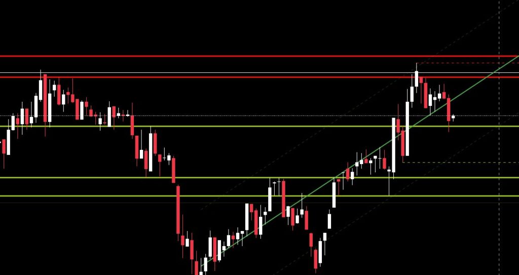
- Support lines → Lime color
- Resistance lines → Red color
Support and resistance lines are thicker when they re stronger and are fading if they are not
- Recent Higher High → Red dashed line, if price break through color becomes orange
- Recent Lower Low → Lime dashed line, if price break through color becomes orange
- Consolidation → If price range remain between HH and LL the background becomes dark blue and marks a consolidation period until the price breaks one of the two points.
- Regrassion
- Middle line → Continius line red for bearish trend or green for bullish trend.
- Upper – Lower lines → Dashed lines matching color with the middle line but faded.
What the indicator actually does
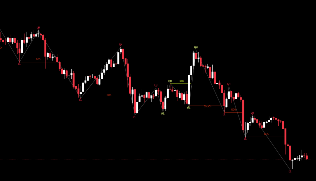
- Track swings. It detects higher highs, lower lows, and every meaningful pivot. It tags each one and keeps a history of where they formed.
- Builds level clusters. If multiple pivots happen around the same price, the indicator groups them and marks that zone as support or resistance.
- Measures Reaction Strength. Every level gets evaluated based on how many times price touched or rejected it. Strong levels get bold lines and weak ones stay light.
- Identifies tight ranges.When price compresses between a recent high and low and the range becomes tight relative to ATR, it draws a consolidation box.
- Draws a structural regression channel. If the swing pattern shows a clean trend sequence, the indicator calculates a straight trend channel based on that structure.
The goal here is to speed up decision making. Support and resistance zones give you context: where entries make sense, where exits should go, and where price might snap back. This indicator pulls all of that into one visual system so I can scan faster, react cleaner, and avoid drawing the same lines again and again on every chart.